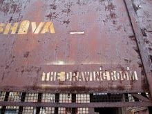
 An example of an (almost) duo-tone broadsheet advertising an arts festival which also 'draws' with its type. Microwave International New Media Arts Festival 2006 by Milkxhake.
 An interesting and simplistic example of an attention grabbing promotional broadsheet. The Corner Berlin (a new marketing department for exclusive fashion brands) by E-design + communication.
 These are "invitations for a series of readings concerning design organised by Dutch Design Centre Initiative (DDC-I). For three invitations, Pantone 673 was used in the first, Pantone red in the second, and black in the third. The same image was re-printed various times to give the impression of superimposed layers."
 This piece is also a cool approach to the concept of reveal, to remove the blocking for-ground boxes would reveal the text and meaning. Doctor Who vs Type by Thorbjorn Ankerstjerne.
All images from 'Color and Layout' by Otto and Olaf, Harper Collins Publishers, New York, 2008

Very nice examples!
ReplyDeletealso interesting is
reveal (selection out of the thesaurus) - tell, let slip, let drop, give away, release, leak, circulate, uncover, bring to light ... maybe elements 'drop' out of the publication? maybe something circulates through the publication? maybe something 'leaked' onto the publication?
a bit like when you write on a sheet of paper there are sometimes traces of what you wrote embossed on the sheet underneath.
or another 'leak' would be the black fingers one gets from reading newspapers ...
maybe something reacts to light and comes out (like heat sensitive paper, or light sensitive paper (is that photographic paper?) or invisible ink ...)