Thursday 19 March 2009

Final preparations

The last preparations for the final presentation are well on their way...
Ana's skills with a guillotine.
The final double sided A2 sheet before folding

Me being pleased with the plastic wallet envelope feature and the (almost)finished product.

Tuesday 17 March 2009

Crayons and watercolour


We are enjoying the experiments with different media! It has been a while since we played around with crayons, paint... Feels quite free and expressive. Drawing is like therapy.

Sunday 15 March 2009

Thumbnail backgrounds and outlines


Some brief experimentation with outlining (framing) the thumbnails with different weights and types of line. Also using a background tint. Since we are printing on off white newsprint paper a background colour would have to be carefully selected.


Saturday 14 March 2009

Tuesday 10 March 2009

Back to thumbnails


So since we are back to the idea of showing some of the drawings as thumbnails we are now playing around with layouts for that. Based on the size of thumbnails we created before, that works as a grid and the drawings will be of different sizes laid out on that structure. We were thinking to try out the drawn elements in the background and on the other side of the page to maybe have the info about the drawings in the same place as the thumbnail. For the drawings that are slightly bigger we might put some biography of the artist.

Monday 9 March 2009

Tutorial

We had another tutorial today with Marit and it was very useful. We had plans of only making one single page, double sided, A2 broadsheet but Marit said that wouldn't really be enough as our final outcome. So now we are back to thinking two A2's and to show some or many of the drawings again. She also gave us the idea to fill out the content with some biography for some of the artists. We had discussions after the tutorial and we will meet again tomorrow to do some work together. One thing we are going to try is to make the drawn lines with crayons or pen and then scan it in to get more of a real feeling. The goal tomorrow is to create a design for the whole thing together so that we then can go off individually and work more towards one final piece. We also need to test print on some newsprint in the computer room to see what the colours and fonts look like on the paper, to get an idea of how see-through it will be. Marit said that we are okey with time though and at least the dynamic of the group is working really well. This morning in our PPD talk we heard some horror stories from groups that are not really getting on. Obviously we chose to work together but you never really know how well it will turn out to be but so far for us everything is good and enjoyable.

News overprint

Another image showing overlapping/revealing
'Futurismo' newspaper cover, 1933, Designer unknown
The newspaper continues to serve as foreground and background for many messages signaling immediacy to a viewer. Overprinting the basic newspaper page with additional headlines or images is one way to bust through the confines of textual density.

Text and image from 'Icons of Graphic Design', Steven Heller and Mirko Ilic, Thames and Hudson, 2008.

Sunday 8 March 2009

Playing around


Just trying out different ideas. Here the blank A4 space on the back is in the same place as the A4 square with all the names. If printed on newsprint they would show through a little I guess. The names could even be printed back to front on the cover so that you had to open it up and look at the other side, towards the light, to see what it actually said. It is on the theme of what can fill a blank space and the idea of how drawing is based on lines most often.

Stealing ideas...


...and playing with them.

Inspiration from Marit part 2.


Some more good examples or work were you can use the theme "reveal".

Overlapping design

Overlapping and revealing/concealing design by Thomas.Matthews


Design Council 'Design Plan' invitation, 2008, reprinted over left over paper from previous Design Council Publications, using vegetable based inks. Taken from http://www.thomasmatthews.com/
Thomas.Matthews are fab!


Saturday 7 March 2009

Inspiration from Marit


Marit just sent me some images that are very inspiring and follows our thinking pattern at the moment, the idea of the blank space and the pre-decided format etc. 

no.2


New ideas start getting shape after the tutorial. This concept came up due to the idea of the basic starting point of this event. Each artist receives a blank A4 130gsm cartiridge paper sheet and produces a drawing/painting/whatever they want and donate it to the gallery. Here in this layout we are trying to represent the mystery and expectation surrounding the blank space and it's possibilities, also by supplying the names of these artist some of which are very well known names.

We are very open and would love some feedback from anyone who wishes to contribute!!!

Friday 6 March 2009

Tutorial


These are the very first layouts we tried for this project. Initial ideas that have been broken already, giving space for further development and new research. We had a great tutorial that opened up and challenged our boundaries.

Thursday 5 March 2009

GF Smith


This afternoon we had a meeting with Alyson Hurst, a Graphic Art Consultant for the paper company GF Smith. As we went through their catalogue she explained and gave us lot of information about the different papers they have but also some information about the various paper mills that produce the paper in the first place. With her she had some amazing looking brochures and promotional publications and we got to keep many of them. It was a great meeting, not only because of all that we learnt and the information we got but also in terms of future contacts, how she would be happy to help us getting in contact with some really good printers for example. 

Wednesday 4 March 2009

Ideas from the book 'Color and Layout'

I had a flick through the lovely book 'Color and Layout' by Otto and Olaf and found some nice examples relating to our project:


An example of an (almost) duo-tone broadsheet advertising an arts festival which also 'draws' with its type. Microwave International New Media Arts Festival 2006 by Milkxhake.

An interesting and simplistic example of an attention grabbing promotional broadsheet. The Corner Berlin (a new marketing department for exclusive fashion brands) by E-design + communication.

These are "invitations for a series of readings concerning design organised by Dutch Design Centre Initiative (DDC-I). For three invitations, Pantone 673 was used in the first, Pantone red in the second, and black in the third. The same image was re-printed various times to give the impression of superimposed layers."

The idea of layering the layer image and therefore hiding/distorting it could be used in conjunction with our theme idea 'reveal'.

This piece is also a cool approach to the concept of reveal, to remove the blocking for-ground boxes would reveal the text and meaning. Doctor Who vs Type by Thorbjorn Ankerstjerne.

All images from 'Color and Layout' by Otto and Olaf, Harper Collins Publishers, New York, 2008

Monday 2 March 2009

Book Design


Not necessary all that relevant to this project but very inspiring in general, The Book Cover Archive is a web-site full of amazing book covers both older and new ones.
Find it on bookcoverarchive

Playing with type


We are thinking of playing with type in our publication. Here are a few lovely examples of how nicely it can be done. Unfortunately I can't remember where I found them.


Tutorial

Grid with thumbnails

Playing with type as drawing

Interesting different directions of type

Beautiful!!!

Great samples of printing on newsprint


We had a tutorial with Marit and Phlippa today. They showed us lovely examples of printed material. We had already talked to Marit about the idea of using newsprint for this project and she brought very nice examples of graphic design printed in this material. We talked about our research regarding printers and that we weren't being able to find a service that would print A2 double sided on newsprint. Marit told us we didn't actually need to produce a finished piece, that a mockup would be fine because the idea is to present to the client the possibilities of production, the quotations for the production cost. Usually designers cannot produce one single finished piece in a presentation, in this case especially because we would probably have to use litho or offset printing and that can only be done in a large number of copies. We aslo discussed the idea of having a theme as a way to pull our piece together. So the theme would have to relate to the gallery and to the fundraiser event and our inicial idea for the theme was to do with "revealing". This is to do with the idea of creating interest in the public of coming to see the artwork at the gallery. Another subject that came to mind is the meaning of drawing itself and how we can "draw" using type and playing with layout. Great new inspiring ideas!!!

Sunday 1 March 2009

Definitions of Drawing

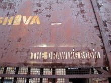
Mary from The Drawing Room explained that the gallery allows a very loose interpretation of the word 'drawing'. the work is relevant so long as the artist considers the piece to be drawing (be it with plastic tape, metal or pencil) or drawing has been a part of the process.
These definitions and quotes about drawing reflect the variety and broadness of the word;
What is it to draw? How do we do it? It is the act of clearing a path for oneself through an invisible iron wall.
Van Gog
Drawing is all
Giacometti
Drawing, de-signifying: breaking the seal, opening the envelope­‑
but it remains sealed.
Yves Bonnefoy
from The Sate of Drawing: Gesture and Act, Tate Publishing, New York
The range of images, feeling, and concepts that can be expressed through the drawing medium is virtually limitless
Drawing is a passionate affair
Tony Godfrey
from Drawing Today, Phaidon, New York, 1990
Conceivably, drawing may be the most haunting obsession the mind can experience... But is it quite, after all, a question of mind?
Paul Valery
from Creative Drawing, McGraw-Hill, 1993
Drawing I take to mean: the element in a work of art which is independent of colour or actual three-dimensional space, the underlying conceptual structure which may be indicated by tone alone.
...A drawing’s basic ingredients are strokes or marks which have a symbolic relationship with experience, not a direct, overall similarity with anything real.
Phillip Rawson
from Drawing, London Oxford University Press, 1969
draw⋅ing
–noun
1. the act of a person or thing that draws.
2. a graphic representation by lines of an object or idea, as with a pencil; a delineation of form without reference to color.
6. the selection, or time of selection, of the winning chance or chances sold by lottery or raffle.
A selection of definitions from dictionary.com